Astrophilia Ed
Imperial Aurex is a Dubai-based investment firm focused on building long-term value through disciplined capital allocation and strategic partnerships. Emerging as a capital arm within a larger trading ecosystem, the brand needed to establish a distinct identity that could reposition it from an operational business to a credible, forward-looking investment entity. The core challenge was to create a brand that communicates trust, authority, and clarity — without relying on predictable financial or commodity-driven visuals. This project involved developing a complete and cohesive brand ecosystem, covering branding, company profile, and website design and development. The objective was to ensure consistency across all touchpoints while building a strong foundation for future growth. The process began with defining the brand’s positioning and tone. Since Imperial Aurex primarily engages with investors and strategic partners, the communication needed to feel measured, sophisticated, and reliable. The focus was on creating a voice that is confident yet understated — reinforcing credibility without being overly promotional. The visual identity was built around the principles of structure, growth, and precision. Instead of using literal representations like gold or currency symbols, the design direction leaned towards abstraction. The logo was developed as a minimal geometric mark that subtly conveys progression, alignment, and upward movement. The color palette was kept refined and controlled, using deep tones to evoke authority and stability, complemented by subtle accents for contrast. Alongside the identity, a comprehensive visual system was created, including typography, iconography, and graphic elements. These components ensure consistency across applications while allowing flexibility for different formats and use cases. The company profile was designed as a key communication tool for investors and partners. The focus was on clarity, structure, and readability, presenting information in a concise yet impactful manner. The layout uses strong hierarchy and minimal visuals to guide the reader, ensuring the content remains the primary focus while reinforcing the brand’s premium positioning. The website was developed as a one-page experience, designed to communicate the brand’s narrative in a streamlined and structured format. Each section is carefully organized to guide users through the firm’s philosophy, approach, and offerings. The design follows the same visual language, using clean layouts, balanced spacing, and subtle graphic elements to create a professional and cohesive experience. Built on Wix, the website is fully responsive and designed for scalability. The modular structure allows for future expansion into a multi-page platform as the business evolves, ensuring long-term usability. Overall, the project delivers a unified brand system that aligns strategy with execution. Imperial Aurex now has a clear and consistent identity, supported by strong communication tools and a refined digital presence — positioning it as a credible and future-ready investment firm.
Toys & Games | India | 2022-PrESENT
Industry: Marine
Location: Dubai
Year: 2026
The Problem We Were Solving
Space education is extraordinary as a subject, and almost universally terrible as an experience.
The existing market was split between dense academic textbooks children wouldn't touch and cheap plastic toys that had nothing educational in them. There was no brand sitting at the intersection of genuine learning and genuine play.
Astrophilia was built to own that gap, a brand that parents trusted for its educational rigour and children reached for because it was actually fun.
01
The Market Gap
Educational space content existed either as textbooks or as novelty toys. No brand combined genuine learning with genuine play at a premium quality level accessible to Indian families.
02
The Opportunity
Parents actively want their children curious about science. Children respond to exploration and discovery. A brand that combined real astronomical content with beautifully designed games could own the category.
03
The Design Challenge
Build something scientifically credible enough for parents to trust, visually exciting enough for children to want, and beautiful enough to justify a premium price point on any shelf.
04
The Solution
A brand system built around wonder — not childish, not academic. Every visual decision, every product, every piece of packaging designed to feel like a mission briefing from a space agency that actually cares about design.
Brand Strategy
"We don't make toys about space. We make missions. Every product is an assignment."
The strategic foundation for Astrophilia was built around one idea: exploration as a mindset, not just a subject. Children who play with Astrophilia aren't learning about space, they're becoming explorers.
This shift from educational product to identity brand changed everything, from the name (Greek for "love of stars") to the visual language to the packaging copy.
Positioning
The only brand where scientific accuracy and genuine play are equally non-negotiable.
Audience
Curious children aged 3–14. Parents who invest in learning. Grandparents who want meaningful gifts.
Personality
Precise. Adventurous. Warm. Never condescending. Speaks to children as future scientists.
Tone of Voice
Mission briefing meets bedtime story. Authoritative but warm. Every word sounds like it was written by a scientist who loves children.
Name Origin
"Astrophilia" from Greek. Astro (star) + Philia (love of). A love of stars. Simple, memorable, and scientifically elegant.
Price Positioning
Mid-premium. Affordable enough to be a birthday gift, premium enough to feel special when unwrapped.
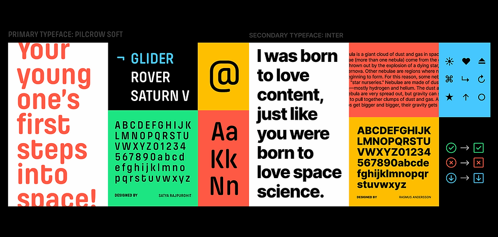
Brand IDENTITY
The mark. The palette.
The full system.
Our identity is simple and clean. With us, exploring the universe is no more rocket science. We do more with less, but we are never bland or boring
We stand out confidently with a bold usage of our logo. Dramatic compositions with short and snappy writing defines our brand tone— we were born to impress. But we are never aggressive or inaccessible
Our identity reflects the exciting nature of space science. We express wonder to evoke curiosity in young minds, but we are never cold and intimidating.
In it's truest form the symbol mirrors the exciting experience of the universe. Shooting, energetic comets converge together to form the 'A' for Astrophilia. The 'A' that is the beginning of all learning—the alphabet. Just like our products the symbol is built of parts that unite to create an enjoyable experience.


.png)
.png)
Packaging Design
Designed for the moment it's picked up.
The packaging for Astrophilia had to work at three moments: on shelf (stop attention), in hand (signal quality), and on opening (create wonder). Each product in the range has a distinct planetary identity while remaining unmistakably Astrophilia.

Packaging Design
"The box is the first mission briefing. It has to earn the attention of a child in three seconds."
Every packaging decision was made with one question: would a curious 10-year-old pick this up without being told to? The answer had to be yes.
Kraft paper interiors, UV printed iconography/product names, and structured inserts designed to present the game components as artefacts, not just pieces.
BOX TYPE
Rigid Box
PRINT
CMYK + Spot
FINISH
Matte + UV

PRODUCT DESIGN
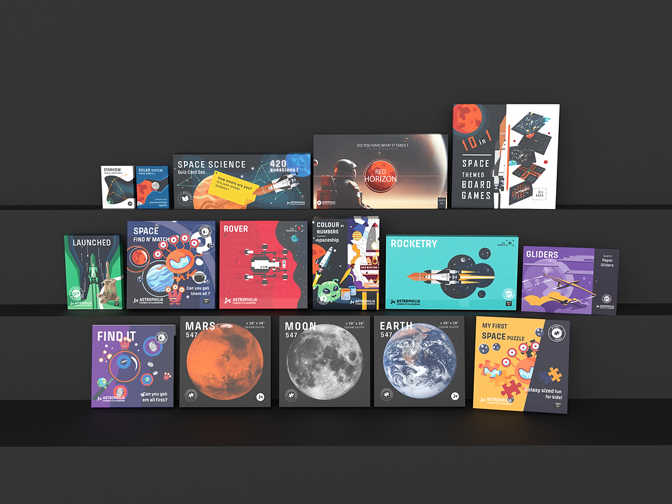
Every piece built to be touched, assembled, and kept.
The physical products in the Astrophilia range span three distinct categories, games, puzzles, and DIY assembly kits, and each one is designed with the same rigour as the packaging that holds it.
Game tokens feel like mission badges.
Cards feel like documents from a real space agency, not something printed on a budget. Puzzle pieces are cut and printed to a tolerance that makes the finished image worth framing. And the assembly kits, rovers, rockets, landers, are engineered so that a ten-year-old can build them independently, feel the satisfaction of a completed structure, and understand something real about the object they've just made.
The principle behind all of it is the same: a child's hands deserve the same quality of design thinking that goes into anything made for adults. Possibly more.


Web Design & Digital
An online experience as immersive as the products.
The Astrophilia website needed to work for two audiences simultaneously, parents making a purchase decision, and children who might be exploring alongside them. The site is immersive, information-rich, and conversion-focused without feeling like a shop.

Social Media System
Content that makes people stop scrolling.
The social media system for Astrophilia is built around four content pillars: Mission Briefings (product reveals), Space Facts (educational carousels), Explorer Stories (community), and Behind the Stars (brand story). The grid is designed to be read as a whole, not just post by post.

Astrophilia is live and operating as a D2C brand available at astrophilia.in and through select retail partners across India. The product range currently includes the Solar System Card Game, the Exploration Board Game, and the Cosmos Quiz Cards.
New products are in development. The brand continues to grow — in reach, in range, and in the number of children who now know the difference between a gas giant and an ice giant.
Where It Is Today
Live. Stocked.
Growing.